Welcome to Matrix Education
To ensure we are showing you the most relevant content, please select your location below.
Select a year to see courses
Select a year to see available courses

In this Guide, we explain the importance of scientific graphs in Physics and how to draw scientific graphs correctly including lines of best fit. This is a really important Physics skill and you’ll need to master it if you want to ace your next Physics Practical exam.
Learn how to:
with the Matrix Practical Skills Workbook.
Get exam-ready for your Physics practical assessments with this FREE practical skills workbook. 
Sharpen your Physics skills
A graph is a visual representation of a relationship between two variables, x (the independent variable) and y (the dependent variable).
Graphs make it easy to identify trends in data that you have collected and can be analysed in order to perform a calculation or a measurement, related to addressing the aim of an experiment.
| Step | Action | Detail |
| 1 | Identify the variables |
|
| 2 | Determine the variable range |
|
| 3 | Determine the scale of the graph |
|
| 4 | Number and label each axis |
|
| 5 | Plot the data points |
|
| 6 | Draw the graph |
|
| 7 | Provide a descriptive title |
|
In Year 11 and 12 Physics, the trends that you will investigate are mostly linear, or can be converted into linear graphs, and, hence, you’ll be required to draw a line of best fit.
An example of a correctly drawn line of best fit is shown below, along with an incorrect one:
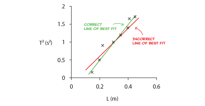
To draw the line of best fit, consider the following:
The main reasons for drawing a line of best fit are to:
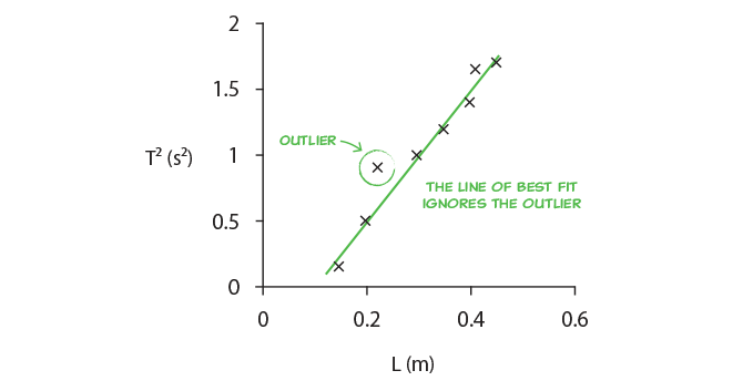
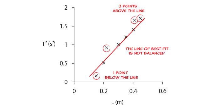
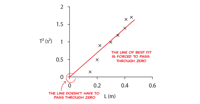
By drawing the line of best fit we are looking for the strongest trend in the data, and in this way reduce the effect of random errors. If we then use the gradient of the line of best fit we look at differences in values rather than absolute values, which reduces or eliminates the effect of systematic errors.
The graphs below illustrate four examples with different types of errors and with no errors:
The gradient represents the result of the experiment and should have a value of 1, so the equation of the line is \(y=x\).
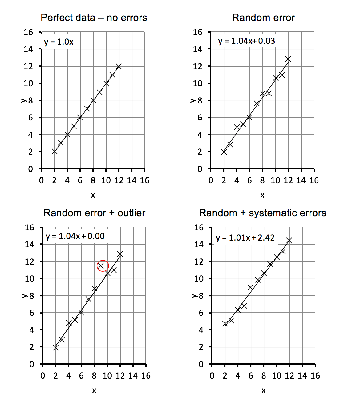
Using a graph gives results that are as good or better than calculating from the data points directly and then averaging, as shown in the table below.
| Types of error present | Result obtained from the gradient of a line of best fit | Result obtained from calculating using all data points and averaging them |
| Perfect data – no errors | 1.00 | 1.00 |
| Random error | 1.04 | 1.04 |
| Random error with outlier | 1.04 | 1.07 |
| Random and systematic errors | 1.01 | 1.47 |
From the table, we can see that:
The example below shows common mistakes by students when drawing lines of best fit. The exact mistakes the students have made are listed below.
Graph 1 shown below is missing labels:
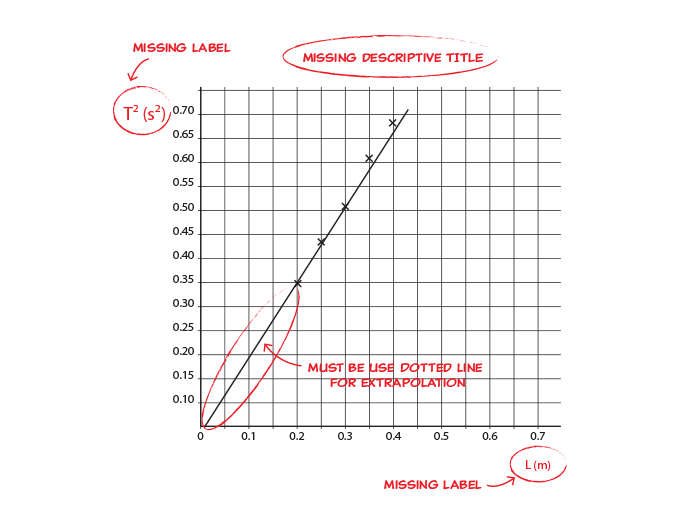
Mistakes in this graph include:
6 Common Mistakes HSC Physics Students Make in Exams
Graph 2 shown below contains an incorrect scale:
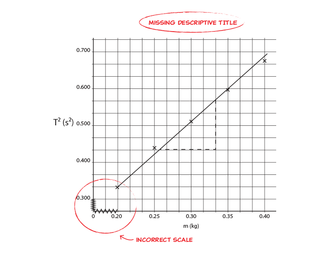
Mistakes in this graph include:
© Matrix Education and www.matrix.edu.au, 2023. Unauthorised use and/or duplication of this material without express and written permission from this site’s author and/or owner is strictly prohibited. Excerpts and links may be used, provided that full and clear credit is given to Matrix Education and www.matrix.edu.au with appropriate and specific direction to the original content.